
Don’t Tell Mama
Brand identity, menu design and social creatives for a pub & restaurant in HSR Layout, Bengaluru.
PROJECT DURATION: 3 MONTHSAccenous Integrals project portfolio · Project delivery with our implementation partner. Outcomes and delivery periods below are reported project information; they are not independently audited performance guarantees. Images on this page are editorial illustrations.
- PROJECT
- Don’t Tell Mama
- SERVICE CATEGORY
- Branding / Brand Identity
- TECH STACK
- Brand identity · Brandbook · Menu design · Social creatives · Event posters · Food photography
Here’s the gist
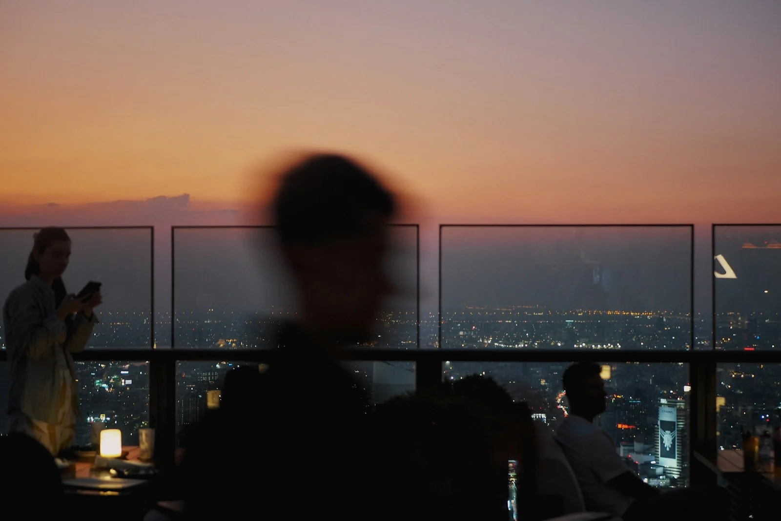
Don’t Tell Mama is a rooftop pub and restaurant on the 4th floor in HSR Layout, Bengaluru. It has over 12 years of history and a character that people remember: Mama, a sassy, protective figure who keeps your secrets and says what everyone is thinking.
The brand had a strong personality, but it needed one clear identity that carried it everywhere a guest meets it. We built a full brandbook with the logo, tone of voice, typography and colour palette, then applied it to menus, social creatives, event posters and the food shoot.
The result is a brand that feels the same on a menu, a Zomato listing and a Friday night poster, and that helped drive 5x weekday and 8x weekend visits alongside digital marketing.
The Challenge
A pub lives on atmosphere. Guests judge it from a feed, a menu or a poster long before they climb the stairs, and Don’t Tell Mama’s personality (bold, quirky, secretive, a little nostalgic) had to show up in all of them.
The brand also lives in many places at once: a physical rooftop, delivery apps, event ticketing platforms, social media and printed menus. Each place had its own format, and each had to still feel like Mama.
Three things had to work at once:
• The identity had to capture Mama’s character, playful and mysterious, in a mark people recognise at a glance.
• Every touchpoint, from menu to event poster to food photo, had to look and sound like the same brand.
• The brand had to work in print and on screen, day and night, from a menu card to a live-music announcement.
So we rebuilt the brand around Mama
We built a full identity system around the character that makes the place unique.
A mark with a secret
The primary logo uses Mama’s silhouette with a finger to her lips, set inside a seal, with alternatives for light and dark backgrounds.
A voice that sounds like Mama
Short, cheeky, slightly sarcastic lines with a hint of wisdom, written the way Mama would say them, on walls, menus and captions.
Colours of a rooftop at dusk
A palette of Bottled Green, Yolk, Eggshell and Olive, paired with Hajine Sans for headings, Public Sans for body text and a handwritten script for personality.
Designed for every touchpoint
Menus, event posters, social creatives and food photography follow one system, so every piece feels like it came from the same place.
Outcome
Delivered and working
8x
weekend visits, with 5x weekday visits, after the rebrand and digital push across Zomato, Swiggy and EazyDiner.
Brandbook-led
Logo, voice, type and colour in one reference.
Event-ready
Live music and party creatives on one visual system.
Menu to feed
Food, cocktail and liquor menus matched to the brand.
Don’t Tell Mama now looks, sounds and feels like itself across every place a guest finds it.
How we got there
From a rooftop with a strong character to a brand that shows it everywhere.
What’s Next
Don’t Tell Mama now has a brand system it can grow with. From here, it can extend the same identity to new menus, seasonal events, merchandise and more Mama Live nights.